Drupal Paragraph Demo Page
myRBS
This page displays the Drupal paragraphs available on the myRBS website. Each section with the name of a paragraph is followed by specifications and a visual example. You can build pages on myRBS using the paragraph blocks below. Some paragraphs have multiple color options most with a max of 3 (white, gray, or dark blue).
| Field Name | Type | Usage | Size |
|---|---|---|---|
| Title | Text Field | Required | 250 char |
| Subtitle | Text Field | Optional | 250 char |
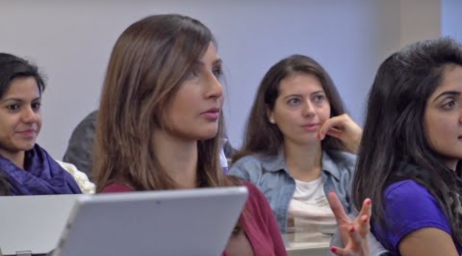
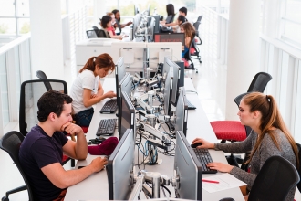
| Image | File | Optional | 1200 x 500 |
| Display Mode | Select | Required | 1 |
Additional notes:
| Field Name | Type | Usage | Size |
|---|---|---|---|
| Title | Text Field | Optional | 250 char |
| Body | Text Area | Required | Unlimited |
| CTA | Link | Optional | 250 char |
| Color Scheme | Select | Required | 1 |
Additional notes:
Lorem ipsum dolor sit amet, consectetur adipiscing elit, sed do eiusmod tempor incididunt ut labore et dolore magna aliqua. Ut enim ad minim veniam, quis nostrud exercitation ullamco laboris nisi ut aliquip ex ea commodo consequat. Duis aute irure dolor in reprehenderit in voluptate velit esse cillum dolore eu fugiat nulla pariatur.
| Lorem ipsum | Lorem ipsum |
|---|---|
| Lorem ipsum | Lorem ipsum |
| Lorem ipsum | Lorem ipsum |
More examples for use of the WYSIWYG (What you see is what you get) paragraph. Note: This will take you to the Rutgers Business School website, but the options available are also applicable to myRBS.
| Field Name | Type | Usage | Size |
|---|---|---|---|
| Eyebrow | Text Field | Optional | 250 char |
| Title | Text Field | Optional | 250 char |
| Subtitle | Text Field | Optional | 250 char |
| Body | Test Area | Optional | Unlimited |
| CTA | Link | Optional | 250 char |
| Download | File | Optional | 1 |
| Image | File | Required | 1100 x 900 |
| Display Mode | Select | Required | 1 |
| Portrait | Checkbox | Optional | N/A |
Additional notes:

| Field Name | Type | Usage | Size |
|---|---|---|---|
| Title | Text Field | Optional | 250 char |
| Subtitle | Text Field | Optional | 250 char |
| Items | Entity | Required | 2 or 4 Image Hover blocks are required |
| Items: Title Link | Link | Required | 1 |
| Items: Hover Title | Text Field | Required | 250 char |
| Items: Hover Subtitle | Text Field | Required | 250 char |
| Items: Hover CTA | Link | Optional* | 1 |
| Items: Image | File | Required | 600 x 360 |
| CTA | Link | Optional | 1 |
| *Title Link works on mobile only, Hover CTA is optional but should be same as Title Link so that it can be accessed on Desktop | |||

| Field Name | Type | Usage | Size |
|---|---|---|---|
| Title | Text Field | Required | 250 char |
| Images | File | Required | * 100 |
| Vertical Display | Checkbox | Optional | 1 |
Additional notes:
| Field Name | Type | Usage | Size |
|---|---|---|---|
| Title | Text Field | Optional | 250 char |
| Intro Text | Text Area | Optional | Unlimited |
| Rows: Title | Text Field | Required | 250 char |
| Rows: Content | Text Area | Required | Unlimited |
| Outro Text | Text Area | Optional | Unlimited |
| Color Scheme | Select | Required | 1 |
Additional notes:
Intro text. Lorem ipsum dolor sit amet, consectetur adipiscing elit, sed do eiusmod tempor incididunt ut labore et dolore magna aliqua. Ut enim ad minim veniam, quis nostrud exercitation ullamco laboris nisi ut aliquip ex ea commodo consequat. Duis aute irure dolor in reprehenderit in voluptate velit esse cillum dolore eu fugiat nulla pariatur.
Rows: Hidden Content-- Lorem ipsum dolor sit amet, consectetur adipiscing elit, sed do eiusmod tempor incididunt ut labore et dolore magna aliqua. Ut enim ad minim veniam, quis nostrud exercitation ullamco laboris nisi ut aliquip ex ea commodo consequat. Duis aute irure dolor in reprehenderit in voluptate velit esse cillum dolore eu fugiat nulla pariatur. Excepteur sint occaecat cupidatat non proident, sunt in culpa qui officia deserunt mollit anim id est laborum.
Rows: Hidden Content-- Lorem ipsum dolor sit amet, consectetur adipiscing elit, sed do eiusmod tempor incididunt ut labore et dolore magna aliqua. Ut enim ad minim veniam, quis nostrud exercitation ullamco laboris nisi ut aliquip ex ea commodo consequat. Duis aute irure dolor in reprehenderit in voluptate velit esse cillum dolore eu fugiat nulla pariatur. Excepteur sint occaecat cupidatat non proident, sunt in culpa qui officia deserunt mollit anim id est laborum.
Rows: Hidden Content -- Lorem ipsum dolor sit amet, consectetur adipiscing elit, sed do eiusmod tempor incididunt ut labore et dolore magna aliqua. Ut enim ad minim veniam, quis nostrud exercitation ullamco laboris nisi ut aliquip ex ea commodo consequat. Duis aute irure dolor in reprehenderit in voluptate velit esse cillum dolore eu fugiat nulla pariatur. Excepteur sint occaecat cupidatat non proident, sunt in culpa qui officia deserunt mollit anim id est laborum.
Outro text. Lorem ipsum dolor sit amet, consectetur adipiscing elit, sed do eiusmod tempor incididunt ut labore et dolore magna aliqua. Ut enim ad minim veniam, quis nostrud exercitation ullamco laboris nisi ut aliquip ex ea commodo consequat. Duis aute irure dolor in reprehenderit in voluptate velit esse cillum dolore eu fugiat nulla pariatur.
| Field Name | Type | Usage | Size |
|---|---|---|---|
| Title | Text Field | Optional | 250 char |
| Heading | Text Area | Required | 250 char |
| Caption | Text Field | Required | Unlimited |
| Image | Text Area | Optional | 780 x 400 |
Additional notes:
Caption Lorem ipsum dolor sit amet, consectetur adipiscing elit, sed do eiusmod tempor incididunt ut labore et dolore magna aliqua

Caption Lorem ipsum dolor sit amet, consectetur adipiscing elit, sed do eiusmod tempor incididunt ut labore et dolore magna aliqua
Caption Lorem ipsum dolor sit amet, consectetur adipiscing elit, sed do eiusmod tempor incididunt ut labore et dolore magna aliqua
| Field Name | Type | Usage | Size |
|---|---|---|---|
| Image | File | Required | 780 x 400 |
| Caption | Text Area | Optional | Unlimited |
Additional notes:
| Field Name | Type | Usage | Size |
|---|---|---|---|
| YouTube URL | Text Field | Required | 250 char |
| Video Background Image | File | Optional | 900 x 500 |
| Caption | Text Field | Optional | 250 char |
Additional notes:
Caption: Lorem ipsum dolor sit amet
| Field Name | Type | Usage | Size |
|---|---|---|---|
| Title | Text Field | Optional | 250 char |
| Display Options | Select | Required | 1 |
| CTA | Link | Optional (not available for News Row of 3) | 250 char |
Additional notes:
| Field Name | Type | Usage |
|---|---|---|
| Title | Text Field | Optional |
| Tag(s) | Select | Required |
Body Lorem ipsum dolor sit amet, consectetur adipiscing elit, sed do eiusmod tempor incididunt ut labore et dolore magna aliqua
Body- Lorem ipsum dolor sit amet, consectetur adipiscing elit
sed do eiusmod tempor incididunt ut labore et dolore magna aliqua
| Field Name | Type | Usage | Size |
|---|---|---|---|
| Title | Text Field | Optional | 255 char |
| Subtitle | Text Field | Optional | 255 Char |
| Column | Content Block | Required | Unlimited |
| Color Scheme | Select | Required | 1 |
| Display Mode | Select | Required | 1 |
| Narrow Display | Checkbox | Optional | 1 |
| Field Name | Type | Usage | Size |
|---|---|---|---|
| Image | File | Optional | 330 x 220 |
| Title | Text Field | Optional | 255 char |
| Text | Text Area | Optional | Unlimited |
| CTA | Link | Optional | 255 char |
Additional notes:

Lorem ipsum dolor sit amet, consectetur adipiscing elit, sed do eiusmod tempor incididunt ut labore et dolore magna aliqua. Ut enim ad minim veniam, quis nostrud exercitation ullamco laboris nisi ut aliquip ex ea commodo consequat.

Lorem ipsum dolor sit amet, consectetur adipiscing elit, sed do eiusmod tempor incididunt ut labore et dolore magna aliqua. Ut enim ad minim veniam, quis nostrud exercitation ullamco laboris nisi ut aliquip ex ea commodo consequat.

Lorem ipsum dolor sit amet, consectetur adipiscing elit, sed do eiusmod tempor incididunt ut labore et dolore magna aliqua. Ut enim ad minim veniam, quis nostrud exercitation ullamco laboris nisi ut aliquip ex ea commodo consequat.
| Field Name | Type | Usage | Size |
|---|---|---|---|
| Title | Text Field | Optional | 255 char |
| Content Blocks | Paragraph reference | Required | Unlimited |
| Block Title | Text Field | Required | 255 char |
| Subtitle | Text Field | Optional | 255 char |
| Expanded Content | Text Area | Required | No character limit |
| Image | File | Optional | 330 x 220 |
Expanded content that is hidden until block is expanded.
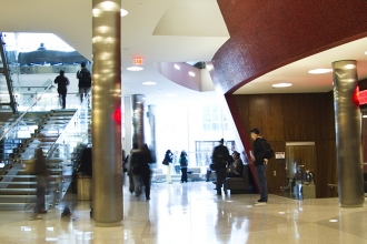
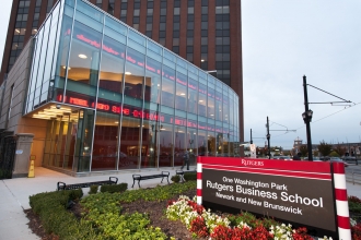
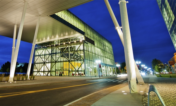
RBS building located at 1 Washington Park